

How Google’s Designers Got the Company on the Same Page
You know how Google last year redesigned its products to align their design, with more white space and more consistent navigation schemes?
You might not have liked all that change. I know I found it jarring, to put it nicely — and I still bristle at some of the things I liked better the old way (gahhh, Google Reader).
In fact, a major overhaul is something Google’s designers had wanted to do for a long time and had previously failed to persuade the company to do, they said on a panel at SXSW today.
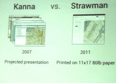
In 2007, designers from multiple Google products put together a set of unified redesign proposals code-named Kanna (Icelandic, meaning to explore, examine or investigate) that was never released.
Among other reasons, the designers think Kanna failed because they presented then-CEO Eric Schmidt and other leaders with a set of four different concepts, with themes like making Google more like desktop clients, or differentiating products by color. It sounded like there were too many options and not enough conviction.
(Above is a picture that shows a thumbnail of one of the Kanna designs. I’ll add the full screenshots if I can get them.)
By contrast, the 2011 project went from some slides to release in a period of a few months, in part because Google’s designers — who are embedded in product teams across the company — have become more strategic about how they manage their roles.
Here’s the basic chain of events. In January 2011, Larry Page IM’ed a couple of people at Google’s internal Creative Lab, asking for some ideas for a company-wide redesign, said Creative Lab member Chris Wiggins. The group quickly put together a “straw man” presentation, printing out before-and-after slides on paper.
“This time was different because the world had a changed a lot, and Google had changed a lot, and design across the industry was ratcheting up,” Wiggins said.
On April 1, Page became CEO and told the team the redesign was approved, and that he wanted it released before the end of summer.
The redesign project was code-named Kennedy, for JFK’s mandate in 1961 for the U.S. to figure out a way to get to the moon before the end of the decade.
Divisions across the company accelerated to a sprint, with Google+, for instance, completely overhauling its design before its launch on June 30.
Members of the design team — including Wiggins, Jon Wiley of Google Search, Nicholas Jitkoff of Google Chrome, Michael Leggett of Gmail and Evelyn Kim of Google Maps — went into detail at SXSW today about how they got everyone on board.
They said they often used the justification “because Larry says so” to push things through, joking that they tried to get him to sign a Post-it note so they could re-use his approval.
More seriously, they built live internal prototypes for Google’s engineers so that people across the company could more easily include the new style, navigation and UI elements in their own products.
They conducted qualitative and quantitative user testing and released internal versions that generated lots of criticism. (The above image is from employee complaints after a release of redesigned Gmail. See, at first Google people hated it, too!)
And so, the redesign was a success story, at least from a company politics point of view. I would say the jury’s still out on whether the redesign is good, though obviously it makes sense for Google to try to make its products more consistent.
The Google designers said today that the new design was still being modified — for instance, a hover-over product menu has been pulled back — and there are many projects that are as yet uncompleted, like the creation of a Google-specific font.
And yes, they know how we hate the huge new font size and massive spacing in Gmail — but that, they said, was a purposeful decision to make the product readable by the largest possible audience.
RELATED POSTS:
- The Homeless Defend Becoming Hotspots
- Pinterest CEO Ben Silbermann’s Lesson for Start-Ups: Go Your Own Way
- The Best and Weirdest Requests and Errands at SXSW From Zaarly, TaskRabbit and Others
- Al Gore and Sean Parker Blame TV and Money for Ruining Politics, and Say Social Media Ought to Fix It
- Letters From SXSW: How to Be “Disruptive”
- SXSW News: Jerry Levin’s StartUp Health Academy for Entrepreneurs Announces First Class
- The Best (And Worst) Marketing Gimmick in Austin
- Forget Cleantech — It’s Cleanweb at SXSW
- Houston Comes to Austin as Kara Swisher Talks Lessons Learned with Dropbox CEO
- After Nearly Doubling Its Userbase in Three Months, Instagram Will Finally Come to Android
- The Power of Power at South By Southwest
- How Jimmy Fallon Uses the Nike FuelBand (It’s Naughty, Of Course)
- Gawker Will Deputize Commenters, Says Sheriff Nick Denton
- Microsoft’s Danah Boyd: Social Media Makes the World More Fearful
- Etsy CEO on Building a Lean Start-Up: Deploy, Deploy, Deploy
- South By Southwest Parties On, Despite the Rain
- At SXSW, Joi Ito Invites Tech Entrepreneurs Into the MIT Media Lab
- Texas Gov. Rick Perry Drops In on South By Southwest
- Can Playing More Games Make Your Life “SuperBetter”? Jane McGonigal Thinks So.
- Google’s Vic Gundotra on Why Plus Isn’t a Minus
- Rain Douses Austin as Crowds Flood Into SXSW
- Checking In and Checking Out South by Southwest
- SXSW Serendipity Gets Yet Another Helper: Kismet
- The Essential SXSW Tech Tool Kit
- Geek in the Heart of Texas: AllThingsD at SXSW 2012


