

The Logo Wears Prada — Yahoo’s Latest Brand Is Skinny and Stark, With ! Intact
As I reported — in the broadest sense of the word — earlier today, Yahoo was set to unveil its new logo tonight.
The last redesign of the iconic Silicon Valley Internet brand was in 2009, and this new one came after a forced-fun, 30-day rollout of logos that Yahoo did not plan to use.
Finally, the march of losers is over, and here’s the winner of Yahoo Logo-palooza in a screenshot I just took, near the old logo — Compare! Contrast! — as well as the logo itself in two versions.
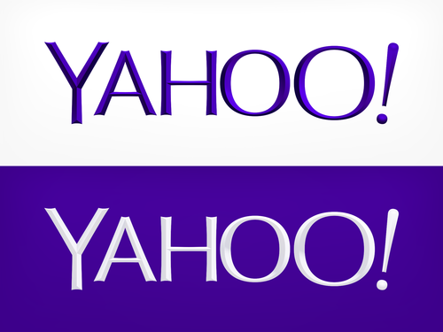
The new logo is slimmer and neat, with the old serifs gone and minus the longtime whimsical tone. Stark and sensible — with an Optima font flavor and a whole lot of sharp edges (not very kid-friendly, IMHO) — it’s very much in keeping with CEO Marissa Mayer’s tidy design sensibilities.
In fact, the new Yahoo logo kind of looks like it is a little hungry all the time, like some supermodel in a Vogue magazine spread. The Logo wears Prada! I consider naming it Giselle (and I wonder if I should offer Giselle a cronut?).
Keeping with the beauty meme, someone just pointed out to me in a direct message on Twitter that the new Yahoo logo looks a lot like the Clinique logo. (I used Clinique a lot back in the day.)
It does, a lot! See here:
![]()
Yahoo CMO Kathy Savitt said in a blog post that the cronut-deprived logo would roll out globally.
And CEO Marissa Mayer weighed in on her Tumblr blog, titled (of course) “Geeking Out on the Logo.”
Apparently, she of the rolled sleeves banged out the new logo with a bunch of Yahoos over a weekend this summer.
“We spent the majority of Saturday and Sunday designing the logo from start to finish, and we had a ton of fun weighing every minute detail,” she wrote. “We knew we wanted a logo that reflected Yahoo — whimsical, yet sophisticated. Modern and fresh, with a nod to our history. Having a human touch, personal. Proud.”
It goes on about mathematics, natch, and beveled edges and such.
And, for those who get upset by this kind of thing, the famous exclamation point remains — on the homepage, it leaps around a bit before settling in, a dancing banger, if you will, like the old Snap! logo. And the color is still purple, so breathe.
The Silicon Valley Internet giant is officially saved! Now I am going to bed.
But here’s a video Yahoo made, if you are a glutton for design punishment, although the enjoyable yodel is there at the end:
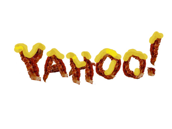
Also, here were my choices for the brand, courtesy of Philly.com, because every logo needs donuts, bacon and cheese:


