

Twitter Tweaks Its Welcome Screen to Better Explain Itself
Twitter’s IPO is just around the corner — and it’s already showing signs of change.
The company quietly updated the Twitter.com homepage over the weekend, changing the visual design and welcome text that people see when first encountering the service.
Seen above, the new design is subtle, and focuses on two major points: Mobile, and just exactly what newcomers to Twitter should expect.
The mobile point is pretty straightforward: Twitter considers itself suited to mobile above other platforms, a strength for any Internet company in a time where audiences are moving en masse to phones from desktops.
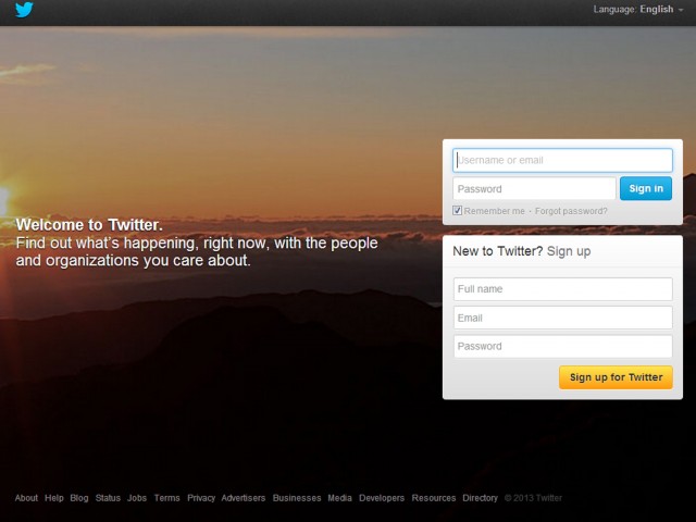
But the language changes, while minor, are important. Look at the old welcome screen below:
It’s an attractive graphic, with a nice-enough text intro that speaks to Twitter’s immediacy. (“Find out what’s happening right now,” it said.) But the new copy actually explains how the company expects us to use Twitter: To start conversations, be they with friends and people you know, or with celebrities and national figures.
It’s the whole reason Twitter introduced its conversations design changes in August, and why it plans on a larger redesign to make the entire service easier for the masses to use.
A minor update, to be sure. But no change is without its reasons.


