

Samsung Document Notes Their Smartphone Icons Not Always Iconic
Although a Samsung designer testified on Tuesday that she did not draw any inspiration from Apple, company documents paint a different picture.
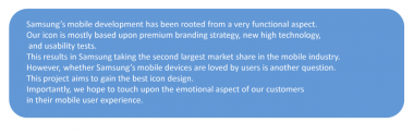
Samsung notes in the “mobile icon design for 2011” document that its premium branding strategy and use of new technology have allowed it to take the second largest market share in the mobile market.
“However, whether Samsung’s mobile devices are loved by users is another question,” the document says, making the case for why Samsung needed, among other things, the best icon design.
Apple has argued that Samsung “slavishly copied” the iPhone and iPad, in the process infringing on several design and utility patents as well as the protected “trade dress” of the Apple phone and tablet. Samsung argues that it has not infringed and also says that Apple’s patents should be found to be invalid.
Galaxy icon designer Jeeyuen Wang testified on Tuesday that she had not copied Apple’s icons when designing the Galaxy’s iconography.
“Not at all,” she said, via a translator.
The internal Samsung document shows the progress the company had made in various iterations of its TouchWiz interface but compares icons from the iPhone and other technology products and argues for further improvement. The document sets out a variety of goals and a timeline for 2011 improvements to Samsung’s icons.
And here’s the full document:


